Believe those who are seeking the truth. Doubt those who find it. Andre Gide

Sunday, May 18, 2014

G and I in Europe and Japan

Izabella Kaminska reports here on a Credit Suisse comparison of Japan and the Euro area (h/t Scott Sumner). Here is an interesting diagram from that report:


According to Kaminska:
As the analysts note, a powerful fiscal stimulus in Japan helped to counter the demand shortfall. That caused personal consumption to continue to grow until 1997 and investment to rebound almost to its previous peak in just six years — something which isn’t slated for Europe any time soon.

Well, the increase in G counteracting an unexplained decline in I is one interpretation. This is the "deficient demand" interpretation that so many like to portray as obvious. But in fact, it's difficult to ascertain the direction of causality from just a picture.

The Japanese data above corresponds to what I posted some time ago here: What's Up with Japan? In response to that post, Mark Sadowski alerted me to the fact that the Japanese investment series plotted above includes both private and government spending. Here's what things look like when we decompose this aggregate (I discuss in more detail here: Another look at the Koizumi boom):


So it seems that there was a boom in private investment during the Koizumi years (something that Krugman gets wrong here, and something I'm not sure he's acknowledged). Moreover, this boom coincided with a slowing or outright contraction in government purchases. And in a liquidity trap era, I might add! What do our conventional "deficient demand" theories have to say about this? Maybe there is something more complicated than a simple IS-LM+liquidity trap story going on? I'm just asking. Humbly yours, DA.

Wednesday, March 26, 2014

Employment Along the Canada-U.S. Border (Part 2)

This is a follow-up to my earlier post: Employment Along the Canada-U.S. Border. In that post, I reported employment ratios and participation rates for three regions: Canada, U.S. states that bordered Canada, and U.S. states that did not border Canada. The main conclusion was that U.S. border states behave a lot more like non-border states, than they do Canada.

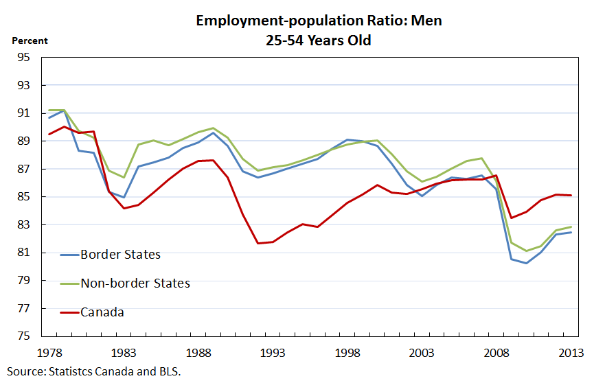
In this post, I (well, my fine research assistant, Lily, actually) report the same data but controlling for age and sex. In particular, I restrict attention to "prime age" workers--the age range 25-54 years old. I also divide the groups by sex. Here is what we get.


Participation rates for prime-age males has been declining steadily over time, but the decline seems to be much more dramatic in the U.S. Again, the border states follow their southern, rather than northern, counterparts.


The declining participation rates among men have been offset in part by the rising participation rates among prime-age women. Since about 2000, the participation rate among Canadian prime-age women continues to rise and remain stable, while in the U.S., the participation rate declines a bit. Again, the border states look more like their southern counterparts.


The great Canadian slump is evident in the 1990s. By the early 2000s, the employment to population ratio of prime-age males in both countries were roughly the same. The most recent recession hit the U.S. more severely than in Canada. Again, note that the border states followed their U.S. counterparts more closely than their Canadian neighbors.


According to this data, Canadian prime-age women were hardly affected by the recent recession.The pattern here is similar to the labor force participation rates described above.

While we can't say for sure just by looking at this data, I suspect that national policy differences are driving much of the different behavior here. But before I start looking for what these policy differences might be, I'll ask my trusty R.A. to look at sectoral decompositions.

Friday, March 21, 2014

Inflation expectations and real treasury yields

My colleague Kevin Kliesen supplies me with the following updates on inflation expectations and real treasury yields.

The first two plots show not very much action since the beginning of the year. The latest data show a recent tick down in inflation expectations, and a tick up in real yields:


Here is what the data looks like since 2007. Following some volatile behavior during the crisis, inflation expectations have roughly remained stable since 2009.


The interesting behavior since that time was fall yields and a flattening of the yield curve (nominal and real).  That downward trend appears to have reversed in mid 2013 (the taper tantrum), but has more or less remained stable since then (with the exception of the 2-year real, which has declined somewhat).

So while the real yield curve has steepened as of late, real yields are still well below where they were before the crisis (especially at the short end).

Friday, March 14, 2014

Employment Along the Canada-U.S. Border

I've written about differences in the Canadian and U.S. labor markets before; see here.  I see that Steve Williamson has recently chimed in as well with this: Why are Canadians Working so Much More than Americans?

A question that interested me is to what extent this cross-country difference is driven by regional considerations. That is, we know that most of the Canadian population lives and works near the U.S. border (the 49th parallel):


Now consider creating a new country consisting of U.S. border states: Washington, Montana, North Dakota, Minnesota, Wisconsin, Michigan, Ohio, New York, Vermont, New Hampshire and Maine (I exclude Alaska, Idaho, and Pennsylvania). If we were to combine these border states with Canada, the region of interest would look roughly like this (map is a little off, but you get the idea):


The question is this: Would you expect the labor market in the U.S. border states to look more like the Canadian labor market or more like the U.S. labor market?

There is good reason to believe, I think, that the demographics across the two countries are pretty similar (though certainly not identical). If the type of economic activity along the border is roughly similar across the two countries, then one might reasonably expect similar labor market behavior in Canada and the border states. But this is not what we see at all.

Here is a plot of the participation rate (employment plus unemployment as a ratio of the working age population):


The U.S. border states look a lot more like the rest of the U.S. and not like Canada at all. Here is a plot of the employment rate (employment as a ratio of the working age population):


Once again, the border states look more like the U.S. in general, rather than Canada.

A preliminary conclusion is as follows: [1] If Canada-U.S. demographics are roughly similar; and [2] if U.S. border states are roughly similar to their Canadian counterparts in terms of sectoral composition; then the differences we observe between the two countries (in terms of labor market activity) are quite possibly driven by policy differences.

Exactly what sort of policy differences we are talking about here remains an open question.

Thursday, February 20, 2014

2008

Like many people out there, I am eagerly awaiting the release of the full transcripts of the Fed's monetary policy meetings for 2008. When they come out (and it should be very soon), you will be able to find them here.

I expect that the media will have a field day with these. No doubt a number of Fed officials will have said things that, with the benefit of hindsight, they wish they had not said, or said somewhat differently.

Jim Bullard, president of the St. Louis Fed, recently gave a speech on the subject titled: The Notorious Summer of 2008. The slides associated with that speech are available here.

Bullard makes some very good observations.

First, many people think of the financial crisis as beginning in the fall of 2008, with the collapse of Lehman and AIG. In fact, the crisis had been underway for more than a year at that point (August 2007). The fact that the crisis had gone on for over a year without major turmoil suggested to many that the financial system was in fact relatively stable--it seemed to be absorbing various shocks reasonably well. Throughout this period of time, the Fed reacted with conventional monetary policy tools--lowering the Fed Funds target rate from over 5% to 2% over the course of a year.

So what happened? Essentially, an oil price shock. By June 2008, oil prices had more than doubled over the previous year. The real-time data available to decision-makers turned out to greatly underestimate the negative impact of this shock (and other factors as well). The rapidly slowing economy served to greatly exacerbate financial market conditions.

The Bear Sterns event occurred in March 2008. The firm was purchased by J.P. Morgan with help (bailout, depending on one's perspective) from the Fed. Bullard identifies two problems with that deal. One, it suggested that all financial firms larger than Bear could expect some form of insurance from the Fed. Two, while the deal was successful in calming down markets, it possibly had the effect of lulling them into a false sense of security.

Of course, we then had the infamous Lehman event in the fall of 2008. But as Bullard points out, everyone knew that Lehman's was in trouble for at least a year--surely investors were prepared for this. And in any case, investors would have properly insured themselves, no?

Well, no. The big insurer, of course, turned out to AIG. Evidently, very few people had any idea about the potential problems with AIG at the time (which, by the way, was outside the scope of Fed supervision). And so, it was the Lehman-AIG event that brought all financial firms under heightened suspicion--and it was this event that drove the financial crisis from September 2008 and onwards.

We all know how the Fed reacted at the time, and since then. The interesting question here is what the Fed might have done differently in the time leading up to the start of the crisis in 2007 and beyond? It is important to answer this question, I think, in the context of policy making that is constrained to operate with the use real-time data (that is frequently subject to significant revisions as time unfolds).

In any case, it will be interesting to eavesdrop on the discussions that occurred in 2008.

Wednesday, February 19, 2014

Are negative interest rates really the solution?

Miles Kimball believes that the zero lower bound (ZLB) constitutes a significant economic problem (he is not alone, of course). His viewpoint is expressed clearly in the title of his post: America's Huge Mistake on Monetary Policy: How Negative Interest Rates Could Have Stopped the Recession in its Tracks.

That's quite the bold claim. But what is the reasoning behind it? Yes, I can see how a price floor can distort allocations and make things worse than they otherwise might have been if prices were flexible. But would interest rate flexibility really have prevented the recession?

Suppose I wanted to teach this idea in my intermediate macro class, using conventional tools. How would I do it? (Maybe it can't be done, but if not, then someone present me with an alternative.) I think I might start with the following standard diagram depicting the aggregate supply and demand for loanable funds (the foundation of the so-called IS curve):


Suppose the economy starts at point A. (I am assuming a closed economy, so aggregate saving equals aggregate investment.) The real interest rate is positive.

Next, suppose that there is a collapse in investment demand. For the purpose of the present argument, the reason for this collapse is immaterial. It might just be psychology. Or it might be the consequence of a rationally pessimistic downward revision over the expected future after-tax return to capital spending. In either case, the economy moves to a point like B, assuming that the interest rate is flexible.

But, suppose that the Fed is credibly committed to a 2% inflation target. Moreover, suppose that the nominal interest rate cannot fall below zero (the ZLB). Then, when the nominal interest rate hits the ZLB, the real rate of interest is -2%.

If this was a small open economy, the gap between desired saving and desired investment at -2% would result in positive trade balance (as domestic savers would divert their saving to more attractive foreign investments, over the dismal domestic investment opportunities). But in a closed economy, saving must equal investment and so, as the story goes, domestic GDP must decline to equilibrate the market for loanable funds. As domestic income falls (and as people become unemployed), desired domestic savings decline (the Desired Saving function moves from the Full Employment position, to the Under Employment position, in the diagram above).

Now, if this is a fair characterization of the situation as Miles sees it (and it may not be--I am sure he will let us know), then I would say sure, I can see how the ZLB can muck things up a bit. The economy is at point C, but it wants to be at point B (conditional on the pessimistic outlook).

But while point B might constitute an improvement over point C, it does not mean an end to the recession. Domestic capital spending is still depressed, and ultimately, the productive capacity of the economy will diminish. I'm not sure I see how a negative interest rate is supposed to prevent a recession, or get the economy out of a recession, if the fundamental problem is the depressed economic outlook to begin with.

If anyone out there has another way of looking at the problem, please send it along.

***

Update:  Here is a reply from Gerhard Illing:


Hello David,

I am not sure if that is what you are asking for, but at least within the standard NKM framework (with negative time preference shocks)  it is fairly straightforward to illustrate that eliminating the ZLB would allow monetary policy to perfectly stabilize the economy at the natural rate. I just finished a sort of “textbook” version (allowing for an explicit analytical solution) of that framework.
In terms of your graph (with the nominal interest rate as adjustment tool to time preference shocks under sticky prices) it looks as follows:


Presumably you are not happy with the NKM framework as a realistic description of current issues - but within that logic, these arguments follow naturally, in particular if you are on the “secular stagnation” trip.

And here is a further elaboration, provided by Gerhard:
 

Sunday, February 2, 2014

Monitoring Japan


I am as curious as anyone in ascertaining the effects of Japanese Prime Minster Shinzo Abe's QE experiment. Miles Kimball points us here to an early assessment by Marcos Nunes, who writes:
Shinzo Abe was elected in December 2012 on a promise to revive growth and put an end to deflation. How have his promises ‘performed’ one year after taking power? The ‘performance’ will be illustrated by a set of charts.
Nunes focuses on Japanese macroeconomic data beginning roughly with Abe's appointment as PM. But that's only about a year's worth of data. What I want to do here is compare these recent measurements with a longer sample, beginning in the year 2000 (the shaded region in my diagrams correspond to the Koizumi era, which I have written about before here).

First up is Japanese inflation (headline and core):


The evidence unfolding here really does seem to suggest that QE matters for inflation. My coauthor Li Li and I have recently remarked on this here.  Next, let's look at NGDP and RGDP growth:


Well, you know...this does not look so great, does it? While it is true that both NGDP and RGDP are growing, similar growth experiences are evident even in the earlier deflationary periods. Sure, it's nice to see RGDP growth rising recently, but it's still far too early to tell whether it will be sustained. And in any case, note the relatively robust period of growth during the "Koizumi boom" period--an era of deflation and fiscal austerity.

The exchange rate and the stock market:


So the stock market was booming late in the Koizumi era, the exchange rate stable, and core inflation negative. What about trade patterns? Take a look here:


I'll let you make up your own mind. Now for some comparisons with the Eurozone. First, a comparison of broad money growth:


Next, a comparison of inflation rates:


 And finally, a comparison of RGDP growth rates:


So sure, the Eurozone is underperforming as of late, and prospects in Japan are looking relatively good. How good in Japan relative to the Koizuma era, I'm not sure. And how much of the recent Japanese performance can be attributed to QE, one can only speculate. All that I conclude from this data is that QE may be influencing the inflation rate and the exchange rate. But whether it is having a quantitatively significant impact on the real economy is far less certain.

Addendum:

A comment by Noah Smith below suggests that Japanese CPI and GDP deflator are behaving quite differently. This indeed appears to be the case.


So, since about the time of the Asian financial crisis, the relative prices of non-consumer goods and services has declined steadily.